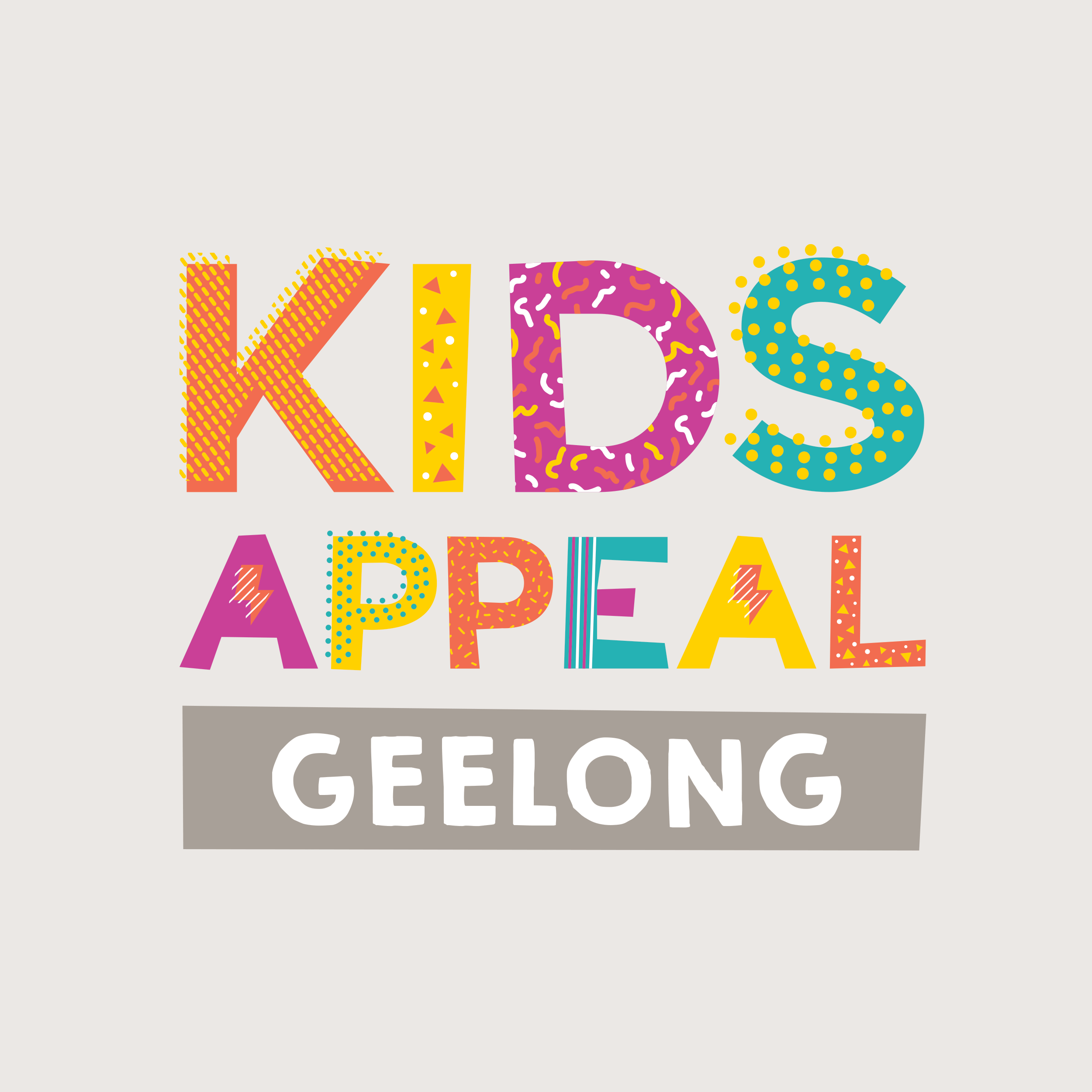
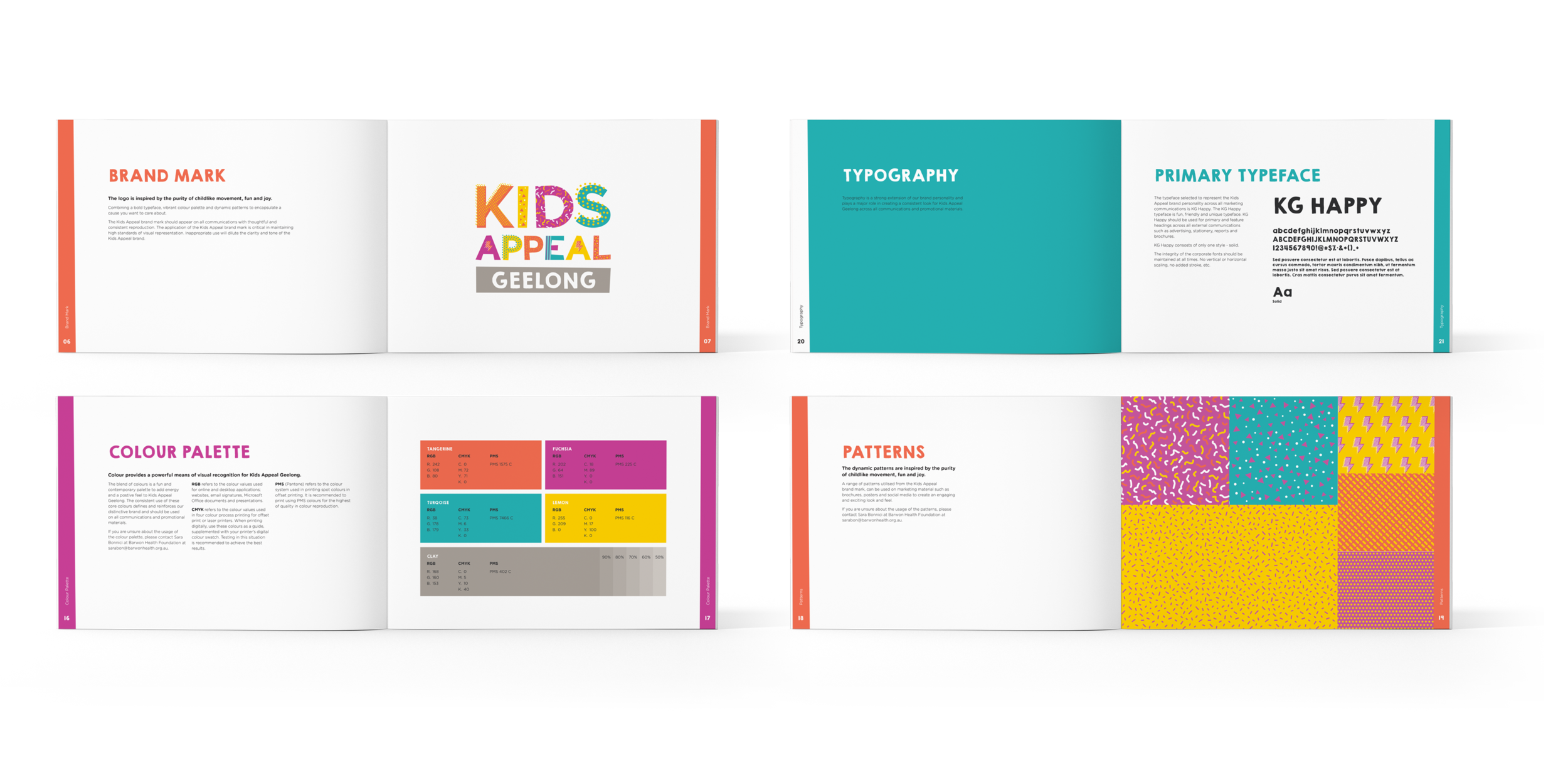
A full brand development process was undertaken for a new Children’s rehabilitation centre in Geelong. The theme of movement, in both the physical and social sense, was expressed using fresh bold colours and patterns.
The brand is a playful child. Full of movement, energy, cheek and childlike confidence.
The fresh colour palette and playful patterns in the logo are versatile and adabtable.